


AG Grid + PrimeNG Sakai Theme
About
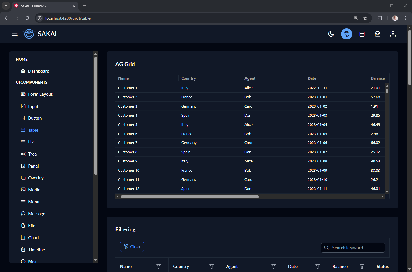
This project demonstrates how to fully integrate AG Grid (Angular) with the PrimeNG Sakai theme, achieving a unified, modern, and consistent visual appearance across both component ecosystems.While AG Grid and PrimeNG are built with different design philosophies, this integration uses PrimeNG’s design tokens (CSS variables) together with AG Grid’s modern theming API to ensure full visual alignment between both component libraries. The result is a clean, professional, and theme‑aware application where light/dark mode automatically synchronizes across all components.
Features
- AG Grid fully themed using PrimeNG Sakai CSS variables
- Automatic light/dark mode sync via Angular Signals
- No custom CSS rewriting — pure design‑token mapping
- Supports virtual scrolling, lazy loading, and large datasets
-
Uses modern AG Grid APIs:
•themeBalham.withPart(...)
•withParams({...}) - Easy to extend and adapt to any PrimeNG theme
Theming Approach
This integration relies on:
1. PrimeNG Sakai CSS variables
Examples:
--p-datatable-header-cell-background--p-datatable-row-background--p-primary-color
These variables change automatically when the user switches theme.
2. AG Grid Modern Theme API
AG Grid’s theming system allows dynamic runtime configuration:
									public readonly layoutService = inject(LayoutService);

readonly theme = computed(() => {
  const scheme = this.layoutService.isDarkTheme() ? colorSchemeDarkBlue : colorSchemeLight;
  return themeBalham
	.withPart(scheme)
	.withParams({
	  oddRowBackgroundColor: 'transparent',
	  backgroundColor: 'var(--p-datatable-row-background)',
	  foregroundColor: 'var(--p-datatable-row-color)',
	  borderColor: 'var(--p-datatable-border-color)',
	  headerBackgroundColor: 'var(--p-datatable-header-cell-background)',
	});
});
Getting Started
									npm i
npm start